" width="1177.5px"/><path d="M 1177.5 195.353 C 1177.5 195.353 1152.098 133.818 1107 124.853 C 1061.902 115.889 1038.36 142.353 1002 142.353 C 965.64 142.353 881.659 107.5 852.5 107.5 C 823.341 107.5 728.441 131.174 688 125 C 647.559 118.826 557.262 107.5 491.5 107.5 C 425.738 107.5 337.907 125 303 125 C 268.093 125 199.67 119.604 173 117.5 C 146.33 115.396 79.739 60.239 63 43.5 C 46.261 26.761 0 0 0 0" fill="transparent" height="195.35348194026892px" id="KeLIibxH6" stroke-dasharray="0" stroke-linecap="butt" stroke-linejoin="miter" stroke-miterlimit="4" stroke-width="1" stroke="rgb(91, 75, 171)" transform="translate(0 18)" width="1177.5px"/><path d="M 1177.5 195.353 C 1177.5 195.353 1152.098 133.818 1107 124.853 C 1061.902 115.889 1038.36 142.353 1002 142.353 C 965.64 142.353 881.659 107.5 852.5 107.5 C 823.341 107.5 728.441 131.174 688 125 C 647.559 118.826 557.262 107.5 491.5 107.5 C 425.738 107.5 337.907 125 303 125 C 268.093 125 199.67 119.604 173 117.5 C 146.33 115.396 79.739 60.239 63 43.5 C 46.261 26.761 0 0 0 0" fill="transparent" height="195.35348194026892px" id="U5tnihtL2" stroke-dasharray="0" stroke-linecap="butt" stroke-linejoin="miter" stroke-miterlimit="4" stroke-width="1" stroke="rgb(91, 75, 171)" transform="translate(0 38)" width="1177.5px"/></g></svg>)
Hello
I’m Heidy Castro, a graphic designer specializing in branding,
visual identity, and creative design concepts. I’m inspired by the
ability of design to transform ideas and emotions into meaningful
visual experiences that connect with people.
My work focuses on balancing creativity and functionality while adding a personal touch to every project. I specialize in branding, with strong skills in Photoshop, Illustrator, and InDesign. As I continue growing as a designer, I hope to explore new creative opportunities and eventually specialize in brand identity and packaging design.
I’m Heidy Castro, a graphic designer specializing in branding, visual identity, and creative design concepts. I’m inspired by the ability of design to transform ideas and emotions into meaningful visual experiences that connect with people.
My work focuses on balancing creativity and functionality while adding a personal touch to every project. I specialize in branding, with strong skills in Photoshop, Illustrator, and InDesign. As I continue growing as a designer, I hope to explore new creative opportunities and eventually specialize in brand identity and packaging design.

" transform="translate(0 18.5)" width="1186px"/><path d="M 0 195.058 C 0 195.058 25.585 133.615 71.009 124.664 C 116.433 115.714 140.145 142.138 176.767 142.138 C 213.389 142.138 297.976 107.337 327.346 107.337 C 356.716 107.337 452.3 130.975 493.034 124.811 C 533.767 118.646 624.716 107.337 690.952 107.337 C 757.188 107.337 845.653 124.811 880.813 124.811 C 915.972 124.811 984.888 119.422 1011.751 117.322 C 1038.614 115.222 1105.685 60.148 1122.545 43.434 C 1139.405 26.721 1186 0 1186 0" fill="transparent" height="195.05756208829007px" id="DEd1RI1LX" stroke-dasharray="0" stroke-linecap="butt" stroke-linejoin="miter" stroke-miterlimit="4" stroke-width="1" stroke="rgb(91, 75, 171)" width="1186px"/><path d="M 0 195.058 C 0 195.058 25.585 133.615 71.009 124.664 C 116.433 115.714 140.145 142.138 176.767 142.138 C 213.389 142.138 297.976 107.337 327.346 107.337 C 356.716 107.337 452.3 130.975 493.034 124.811 C 533.767 118.646 624.716 107.337 690.952 107.337 C 757.188 107.337 845.653 124.811 880.813 124.811 C 915.972 124.811 984.888 119.422 1011.751 117.322 C 1038.614 115.222 1105.685 60.148 1122.545 43.434 C 1139.405 26.721 1186 0 1186 0" fill="transparent" height="195.05756208829007px" id="SvQ5X_JnZ" stroke-dasharray="0" stroke-linecap="butt" stroke-linejoin="miter" stroke-miterlimit="4" stroke-width="1" stroke="rgb(91, 75, 171)" transform="translate(0 38)" width="1186px"/></g></svg>)


Coffee Brand
Objective
The objective of this project was to create an original coffee brand
from concept to execution by a cohesive visual identity that reflects the brand’s personality and appeal.
Process
During the design process, I wanted the coffee brand to feel warm, friendly, and approachable. I began by creating a logo that combined a cat illustration with a coffee cup to clearly communicate the identity of the brand in a creative and memorable way.
The concept was designed so the cat itself visually became part of the coffee cup, helping the logo feel playful while still making it easy to understand what the business offers. For the colour palette, I wanted to create a sense of softness and comfort, so I chose a soft purple-grey tone combined with white and a muted dark blue. These colours
helped give the brand a calm and cozy atmosphere that reflects the experience of enjoying coffee. Once the logo was completed, I applied the branding to the coffee cup design by incorporating the logo along with a repeating pattern inspired by coffee plants, creating a more detailed and cohesive visual identity.
To complete the project, I designed a promotional banner that showcased the products offered by the brand while including supporting information that complemented the overall design.
Tools Used




Rebranding (Plant Matter Kitchen)
Objective
The objective of this project was to redesign and enhance the
existing logo for Plant Matter Kitchen by creating a visual identity
that better represents the restaurant vision. Along with the logo
redesign, a stationery set was created to ensure a cohesive and
professional brand presence across different elements


Process
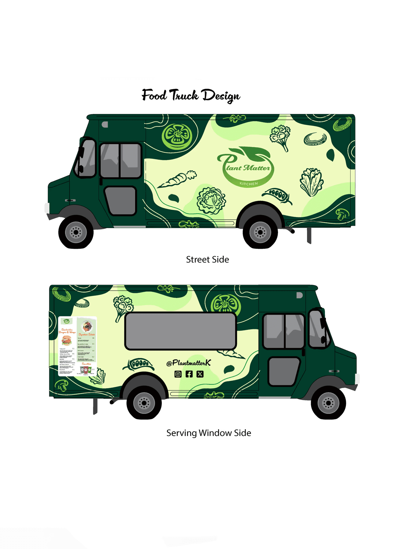
When redesigning the logo, I wanted to keep a connection to the restaurant’s original identity while giving it a more modern and unique look. I began by analyzing the elements used in the original logo and exploring ways to combine them into a design that felt more cohesive and visually engaging.
Throughout the process, my goal was to create a logo that would better represent the restaurant’s welcoming and natural atmosphere.
To support this idea, I selected a more expressive and curvy typeface because I felt it would make the brand appear friendlier and more approachable. For the colour palette, I decided to keep green as the primary colour since it already represented the restaurant and its fresh identity. However, I introduced a yellow tone to create a gradient effect that added warmth and energy to the design.
In the end, the combination of the typography, colours, and redesigned elements helped create a logo that feels more vibrant, lively, and connected to the personality of the restaurant. To expand the visual identity I designed additional branding materials to create a consistent and professional brand experience. This included a business card, envelope, and letterhead, all designed using the same colours, typography, and visual style as the logo.
Tools Used



Craft Beer Design
Objective
In this project, the objective was to create a memorable and
unique design for a craft beer collection.
Process
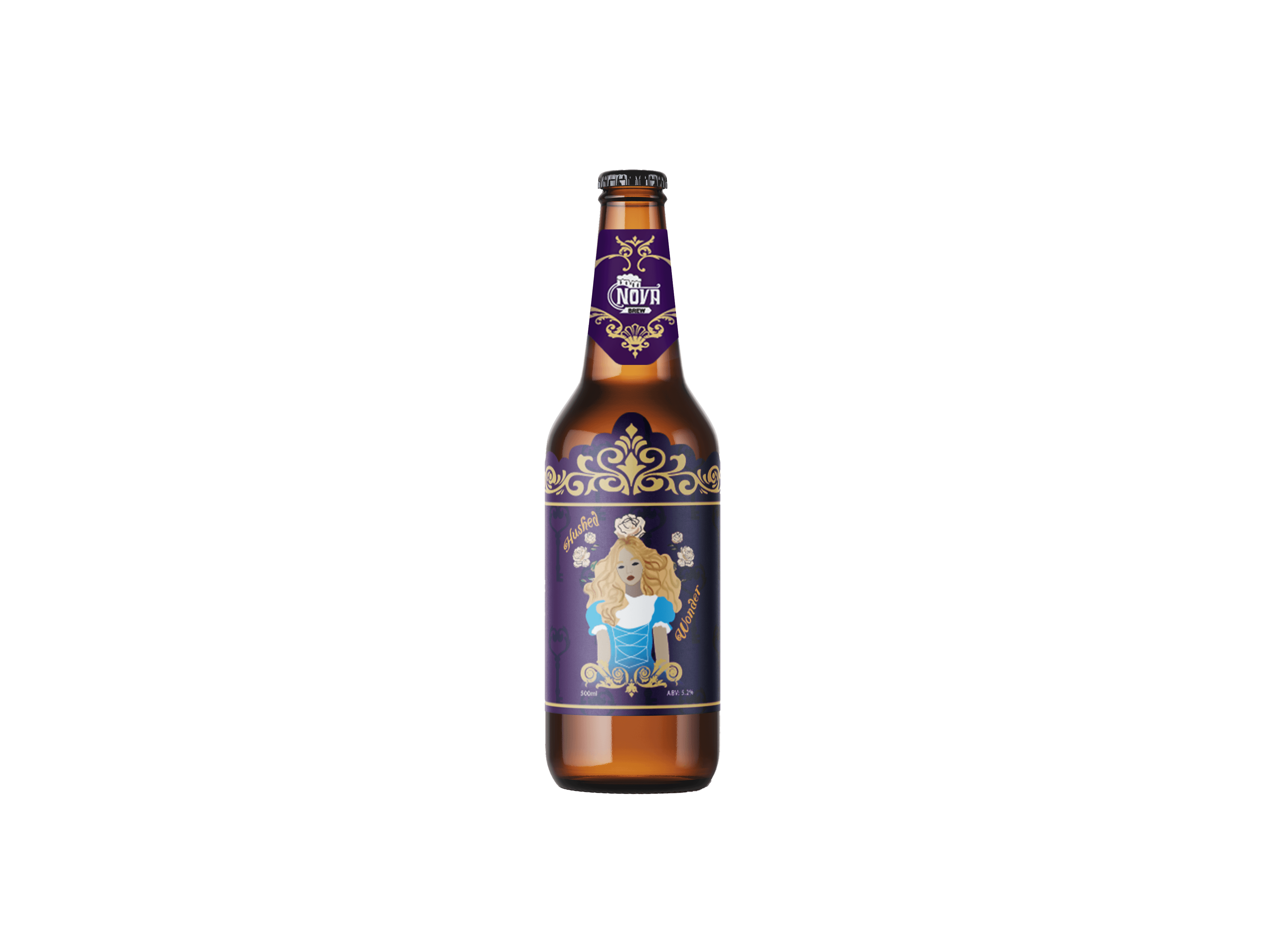
I began the project by researching a variety of craft beer brands and packaging styles, noticing how many craft beers use experimental flavours to stand out. Inspired by this creative approach, I chose Alice in Wonderland as the concept for the collection because of its imaginative and adventurous spirit. The theme also allowed me to create visually engaging designs that felt unique while still being recognizable to consumers.
The design process started with developing the logo and visual identity for the beer collection. I explored elements like ornaments that reflected the fantasy and whimsical atmosphere of Alice in Wonderland, I designed each beer label around a different character from the story, using distinct colours and visual details to represent the flavour and personality of each beer.
To expand the brand experience beyond packaging, I also created advertising materials that would promote the collection consistently across different platforms. This included a promotional banner, social media ads, and a table talker that could be displayed in restaurants or bars to advertise the beers directly to customers. Through this process, I combined branding, packaging, and advertising design to create a unique design that represents what craft beers are in a fun way.
Tools Used

Craft Beer Design
In this project, the objective was to create a memorable and unique design for a craft beer collection.
Learn More →

Artistic Beer Cans Design
Unique illustrations for beer cans, focusing on a more artistic and creative approach to packaging design.
Learn More →

Coffee Brand
An original coffee brand design with a cohesive visual identity that reflects the brand’s personality.
Learn More →
Corporate Identity
An original urban clothing brand with development of a strong visual identity design.
Learn More →

Rebranding
A rebranding of Plant Matter Kitchen, creating a visual identity that better represents the restaurant vision.
Learn More →


Craft Beer Design
In this project, the objective was to create a memorable and unique design for a craft beer collection.
Learn More →Artistic Beer Cans Design
Unique illustrations for beer cans, focusing on a more artistic and creative approach to packaging design.
Learn More →Coffee Brand
An original coffee brand design with a cohesive visual identity that reflects the brand’s personality.
Learn More →Corporate Identity
An original urban clothing brand with development of a strong visual identity design.
Learn More →Rebranding
A rebranding of Plant Matter Kitchen, creating a visual identity that better represents the restaurant vision.
Learn More →Craft Beer Design
Objective
In this project, the objective was to create a memorable and
unique design for a craft beer collection.
Process
I began the project by researching a variety of craft beer brands and packaging styles, noticing how many craft beers use experimental flavours to stand out. Inspired by this creative approach, I chose Alice in Wonderland as the concept for the collection because
of its imaginative and adventurous spirit. The theme also allowed me to create visually engaging designs that felt unique while still being recognizable to consumers.
The design process started with developing the logo and visual identity for the beer collection. I explored elements like ornaments that reflected the fantasy and whimsical atmosphere of Alice in Wonderland, I designed each beer label around a different character
from the story, using distinct colours and visual details to represent the flavour and personality of each beer.
To expand the brand experience beyond packaging, I also created advertising materials that would promote the collection consistently across different platforms. This included a promotional banner, social media ads, and a table talker that could be displayed in restaurants or bars to advertise the beers directly to customers. Through this process, I combined branding, packaging, and advertising design to create a unique design that represents what craft beers are in a fun way.
Tools Used

Rebranding (Plant Matter Kitchen)
Objective
The objective of this project was to redesign and enhance the
existing logo for Plant Matter Kitchen by creating a visual identity
that better represents the restaurant vision. Along with the logo
redesign, a stationery set was created to ensure a cohesive and
professional brand presence across different elements
Process
When redesigning the logo, I wanted to keep a connection to the restaurant’s original identity while giving it a more modern and unique look. I began by analyzing the elements used in the original logo and exploring ways to combine them into a design that felt more cohesive and visually engaging.
Throughout the process, my goal was to create a logo that would better represent the restaurant’s welcoming and natural atmosphere.
To support this idea, I selected a more expressive and curvy typeface because I felt it would make the brand appear friendlier and more approachable. For the colour palette, I decided to keep green as the primary colour since it already represented the restaurant and its fresh identity. However, I introduced a yellow tone to create a gradient effect that added warmth and energy to the design.
In the end, the combination of the typography, colours, and redesigned elements helped create a logo that feels more vibrant, lively, and connected to the personality of the restaurant. To expand the visual identity I designed additional branding materials to create a consistent and professional brand experience. This included a business card, envelope, and letterhead, all designed using the same colours, typography, and visual style as the logo.
Tools Used
Coffee Brand
Objective
The objective of this project was to create an original coffee brand
from concept to execution by developing a cohesive visual identity
that reflects the brand’s personality and appeal.
Process
During the design process, I wanted the coffee brand to feel warm, friendly, and approachable. I began by creating a logo that combined a cat illustration with a coffee cup to clearly communicate the identity of the brand in a creative and memorable way.
The concept was designed so the cat itself visually became part of the coffee cup, helping the logo feel playful while still making it easy to understand what the business offers. For the colour palette, I wanted to create a sense of softness and comfort, so I chose a soft purple-grey tone combined with white and a muted dark blue. These colours
helped give the brand a calm and cozy atmosphere that reflects the experience of enjoying coffee. Once the logo was completed, I applied the branding to the coffee cup design by incorporating the logo along with a repeating pattern inspired by coffee plants, creating a more detailed and cohesive visual identity.
To complete the project, I designed a promotional banner that showcased the products offered by the brand while including supporting information that complemented the overall design.
Tools Used

© 2026 HeidyCastro. All rights reserved.
© 2026 HeidyCastro. All rights reserved.